
James Kinser, Manager of Digital Communications and Content Strategy, shares how our values and audience feedback guided our website redesign to improve user experience.
How do we want to be perceived? Who are our core communities and audiences? How can we best present the Foundation to the world?
These questions are core to our work as a Foundation and how we communicate. In early 2020, we began discussing them with our design partners as we prepared to rebuild our website, aiming to incorporate our values in the redesign process.
They also helped us hone audience research and interviews early in the redesign of the website, which is now live. This audience research and data reflects our commitment to data-based decision making, listening with empathy, including a diversity of perspectives, and meeting accessibility needs. The results, while surprising at times, guided us toward substantial changes based on how people access and consume content on our website.
Audience Behavior Shapes Content
Early in our process, we understood that a large percentage of people who come to the Foundation’s website are first-time visitors. They typically want to learn more about the type of organizations we support, apply for grants, or discover who received a MacArthur Fellowship.
Navigation
When we compared research data with our previous website navigation and how content was structured, we learned that we were not effectively serving a huge portion of our visitors.
To remedy this, we doubled down on our existing communications goals of transparency, highlighting grantee work, and drawing attention to key topics. In addition, we introduced goals to make accessible and engaged experiences, foster connections, and create a flexible and scalable design.
Guided by these goals, we restructured the main site navigation, so visitors would have more transparent and direct access to information about the Foundation, our grantmaking programs, information on grants and grant opportunities, as well as rich content featuring the impact of grantee work.
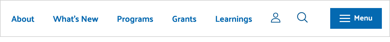
We also added a more expansive menu and enhanced search capabilities to improve access to desired content.
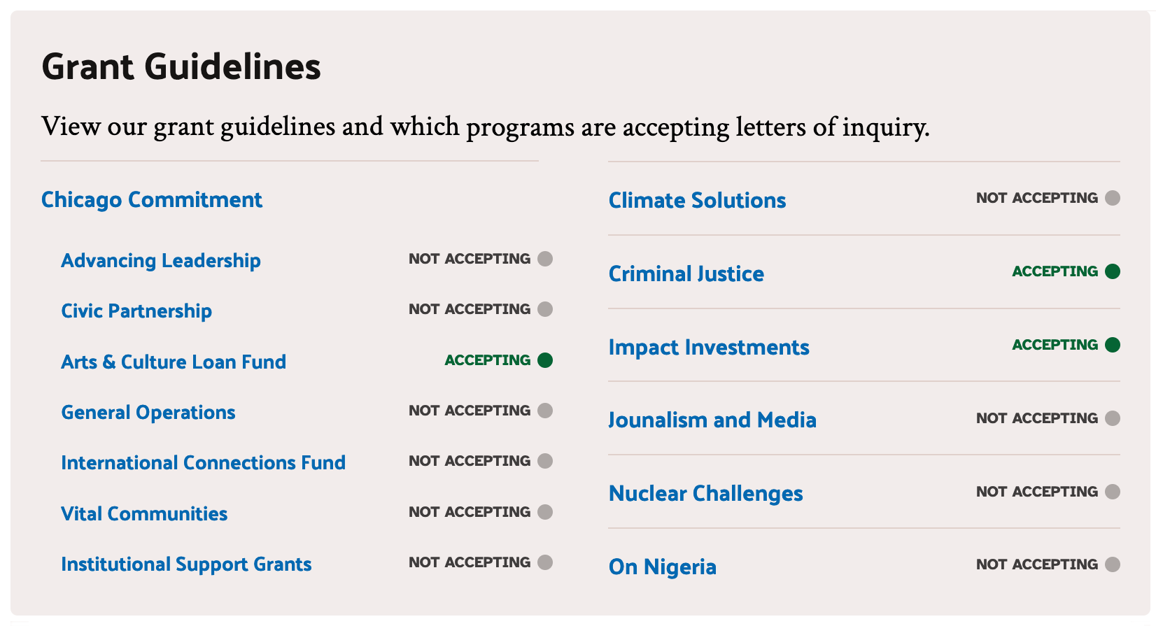
Grants
For grants information, we now have a dedicated section in the main site navigation instead of a single page that was previously challenging to find. By creating separate pages for grant seekers and current grantees, we more successfully serve the unique needs for each audience.
Another surprising insight: many people were visiting multiple pages before discovering that a program was not accepting grant proposals. To streamline access to this information and provide more transparency, we now prominently show on the Info for Grantseekers page which programs are accepting proposals. And we share an illustration summarizing our grant application process. On that page, we also featured details about what we fund more prominently.
Program Pages
We discovered that when visitors explored our program landing pages, they looked for a high-level overview of our work and the organizations we support. Acknowledging this inclination, we now have “Why We Support This Work” and “What We’re Doing” sections as well as readily featured grantmaking statistics and access to grants that represent the scope of the program’s work. These elements, among others help form a more holistic story as people scroll down each program’s page.
Fostering Connections and Engaging Experiences
A New News Section
About eight years ago, we began producing Perspectives—articles by Staff, grantees, and partners that share insights on our work—and Grantee Stories, which provide an in-depth look at grantees’ efforts and impact.
Over time, these articles have become some of our most-viewed content on the website. In fact, we discovered a Perspectives article from 2020 remained our most-read article nearly four years later.
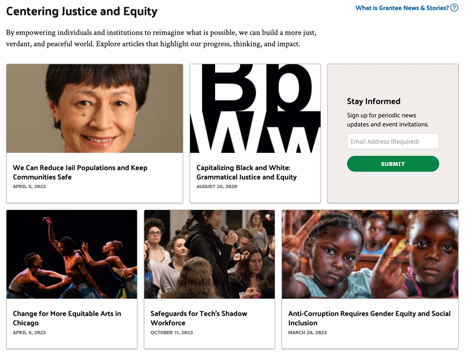
Understanding the richness of these articles and other news we share, we took a three-fold approach to make this content more accessible.
- First, we added a What’s New section to the main site navigation, providing people access to most recently published content.
- Second, on all program landing pages we created a grid of recent news articles with filters, so visitors can more easily explore related content.
- And finally, on the Info for Media and What's New pages, we created a component that would allow us to aggregate content related to contemporary topics in the world. In the example below, we collected both recently published articles and those from several years ago that all relate to our commitment to justice and equity.
Interactivity
Throughout the website, animation and movement improve visitors’ experiences. For example, on a program landing page, content slides in from the sides or bottom to guide the eye toward content and make the page more interactive, based on the reader’s movement. On other pages, like the President’s annual essay, background shapes move to help break up the visual density of large blocks of text.
While these animations make pages more engaging for people to digest, they are also a subtle visual nod to the interconnected nature, depth, and complexity of the Foundation’s work.
Design and Branding
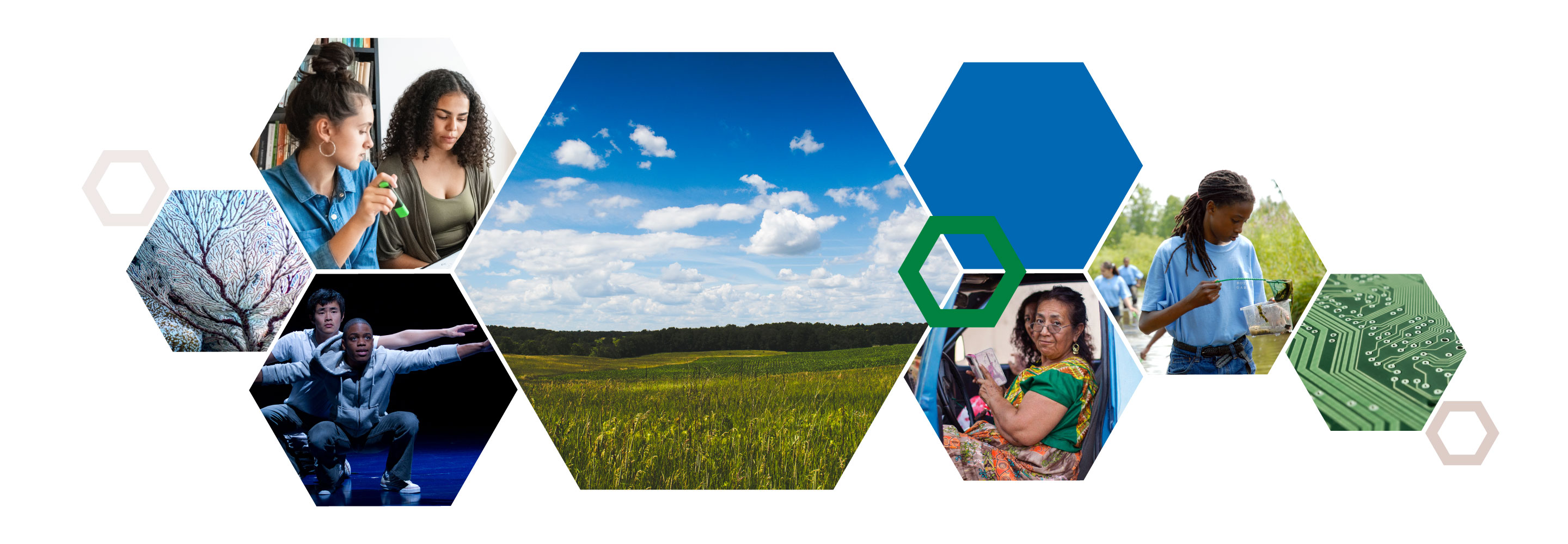
Two key design elements throughout the website hold conceptual significance. Hexagons feature heavily throughout primary pages in the Programs and About sections. These shapes, when grouped together, create a honeycomb pattern that connotes connection and community and allows us to better feature photos of grantees and their activity.
Additionally, three diagonal bars can be found in backgrounds and headers throughout. The trio serves as a reference to our mission of creating a more “just, verdant, and peaceful world.” We nicknamed these design elements the “JVP stripes, and our email communications and social media posts will soon incorporate these redesign and rebranding treatments.
Ongoing Improvements
As we look forward, we will add more interactive elements to the website and continue to optimize content for accessibility and search engines. We will also continue to reference data and conduct research to guide further development of the website. But now, we are happy to provide this new website with improved access to content and enhanced experiences, all thoughtfully shaped by your feedback.
To continue this cycle of feedback that can help influence our direction, we welcome your input.